docs/learning.qmd
tidied_post_meal_data |>
  mutate(overweight = if_else(BMI >= 25, "Overweight", "Not overweight")) |>
  ggplot(aes(x = overweight, y = insulin_glucose_ratio)) +
  geom_jitter()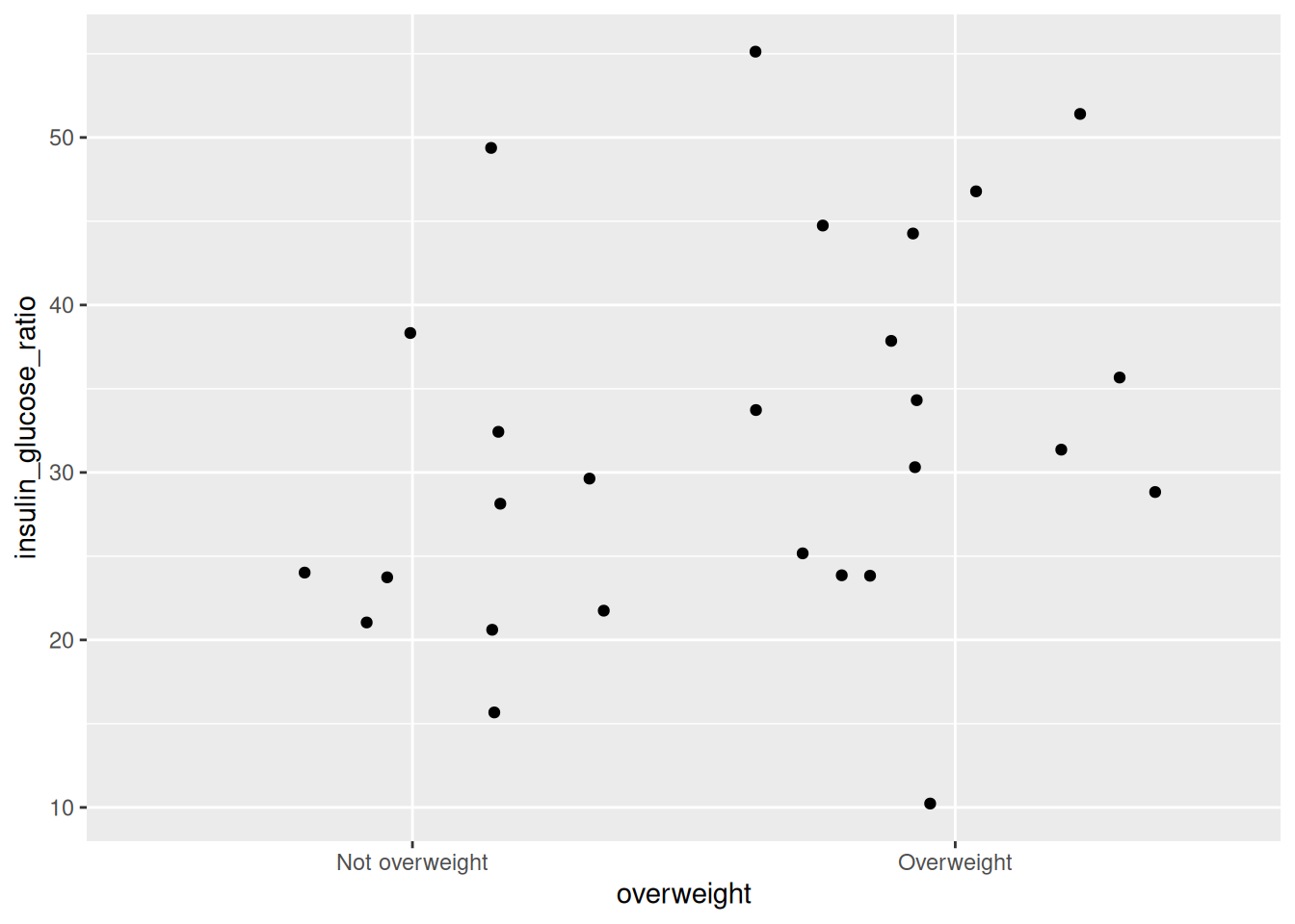
Rarely will you be able to visualize your data or results without some wrangling beforehand. In this session, we will combine what we learned in the wrangling and visualization sessions by piping the output of one into the other.
In the previous session, we learned how to wrangle data using the dplyr package. In this session, we’re going to show and highlight how useful and powerful it is to do some wrangling and directly pipe the output into a plot to visualize it. Often, you might need to do some wrangling only for a specific plot, and it isn’t necessary to save the wrangled data as an intermediate object. So instead, we’ll immediately pipe the wrangled data into a plot.
Based on our data, let’s say we want to see what the distribution of the insulin_glucose_ratio with those who are overweight or not as a categorical variable using BMI greater than or equal to 25 as the threshold. Since we don’t have a variable for being overweight, we need to create one. We can use the mutate() function to create a new column called overweight with a value for being overweight if BMI >= 25 or less than that. Before we create the plot, we need to decide, what type of plot do we want. Since we have a continuous and a discrete variable, these are a few good or common ones we could use:
geom_boxplot(), which makes boxplots that show the median and a measure of range in the data. Boxplots are generally pretty good at showing the spread of data. However, like the reading task about “bar plots”, boxplots can still hide your actual data. It is generally fine to use, but a better geom might be jitter or violin.geom_jitter(), which makes a type of scatterplot, but for discrete and continuous variables. A useful argument to geom_jitter() is width, which controls how wide the jittered points span from the center line. This plot is much better than the boxplot since it shows the actual data, and not summaries like a boxplot does. However, it is not very good when you have lots of data points.geom_violin(), which shows a density distribution like geom_density(). This geom is great when there is a lot of data and geom_jitter() may otherwise appear as a mass of dots.The way you use any of these geoms is the same. If you use one, you can use another. So we’ll show how to use geom_jitter(), because our data are quite small.
At the bottom of the Quarto document, create a new section header called ## Visualizing with a jitter plot. Below that header, create a new code chunk with Ctrl-Alt-ICtrl-Alt-I or with the Palette (Ctrl-Shift-PCtrl-Shift-P, then type “new chunk”).
docs/learning.qmd
tidied_post_meal_data |>
mutate(overweight = if_else(BMI >= 25, "Overweight", "Not overweight")) |>
ggplot(aes(x = overweight, y = insulin_glucose_ratio)) +
geom_jitter()
Run this code chunk with Ctrl-EnterCtrl-Enter and you’ll see a plot with a bunch of points on them. Looking at the plot, we can see that there are more participants that are insulin insensitive (resistant) in the overweight group than the non-overweight group. We can modify the width of the jittered points by adding the argument width to geom_jitter(). For now, we won’t add it.
There are many ways to visualize additional variables in a plot and further explore your data. For that, we can use ggplot2’s colour, shape, size, transparency (“alpha”), and fill aesthetics, as well as “facets”. Faceting in ggplot2 is a way of splitting the plot up into multiple plots when the underlying aesthetics are the same or similar.
The most common and “prettiest” way of adding a third variable is by using colour. Let’s check the relationship between Age and auc_insulin in a scatterplot with geom_point(), while using Group in colour as the third variable.
First, create a new header called ## Plotting three or more variables and a new code chunk with Ctrl-Alt-ICtrl-Alt-I or with the Palette (Ctrl-Shift-PCtrl-Shift-P, then type “new chunk”). Then, write out the code below:
docs/learning.qmd
tidied_post_meal_data |>
  filter(BMI < 30) |>
  ggplot(aes(x = Age, y = auc_insulin, colour = Group)) +
  geom_point()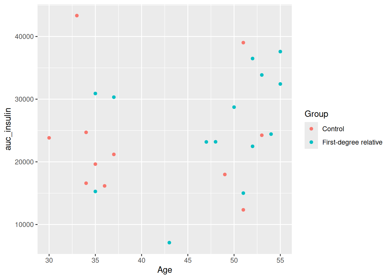
Run this with Ctrl-EnterCtrl-Enter. One thing you’ll quickly notice is that there is a clear grouping in ages between those above and below 40. So let’s make a new column called young that groups people into two categories of being above or below 40 years of age. And instead of looking at the relationship between Age and auc_insulin, let’s look at the relationship between BMI and insulin_glucose_ratio.
With piping, it is really easy to insert a wrangling step in the sequence. So we’ll insert a mutate() below the filter() and make use of the if_else() function to create the new column young. After that, we would like to split the plots up into two subplots, one for each age group. We can do this using facet_grid().
facet_grid() splits the plot up into multiple subplots. For faceting to work, at least one of the first two arguments to facet_grid() is needed. The first two arguments are:
cols: The discrete variable to use to facet the plot column-wise (i.e. side-by-side).rows: The discrete variable to use to facet the plot row-wise (i.e. stacked on top of each other).For both cols and rows, the variable must be wrapped by vars() (e.g. vars(young)). Using the existing code we have, modify it so it looks like the code below:
docs/learning.qmd
tidied_post_meal_data |>
  filter(BMI < 30) |>
  mutate(young = if_else(Age < 40, "Young", "Old")) |>
  ggplot(aes(x = BMI, y = insulin_glucose_ratio, colour = Group)) +
  geom_point() +
  facet_grid(cols = vars(young))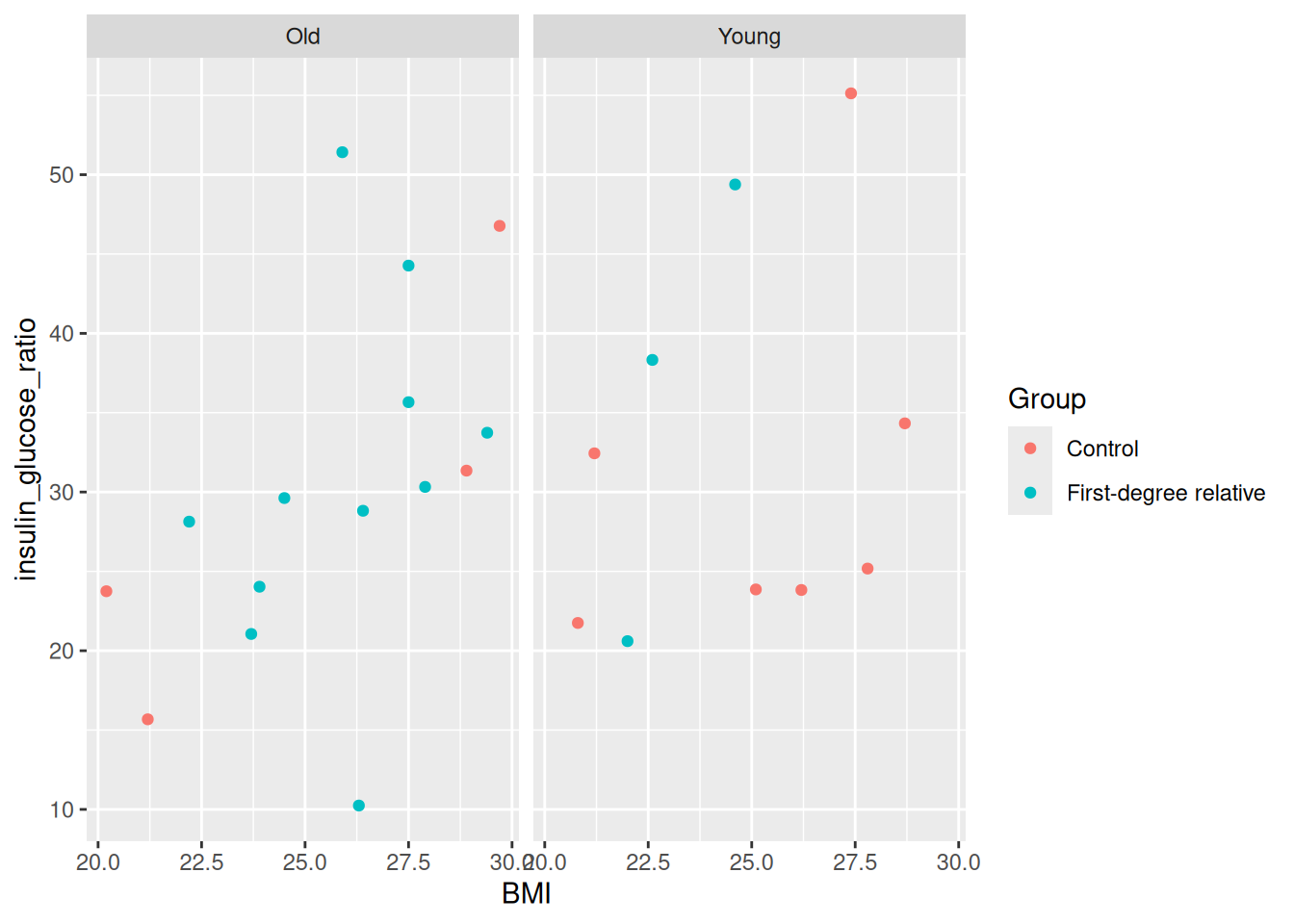
Run this with Ctrl-EnterCtrl-Enter. You’ll see two plots side-by-side, one for each age group. Super neat! Right away, we can see that there are more older people who have first-degree relatives with diabetes, which makes sense since older people will likely have older relatives, and age is a big factor in diabetes. You can also facet by rows, by replacing the cols argument:
docs/learning.qmd
tidied_post_meal_data |>
  filter(BMI < 30) |>
  mutate(young = if_else(Age < 40, "Young", "Old")) |>
  ggplot(aes(x = BMI, y = insulin_glucose_ratio, colour = Group)) +
  geom_point() +
  facet_grid(rows = vars(young))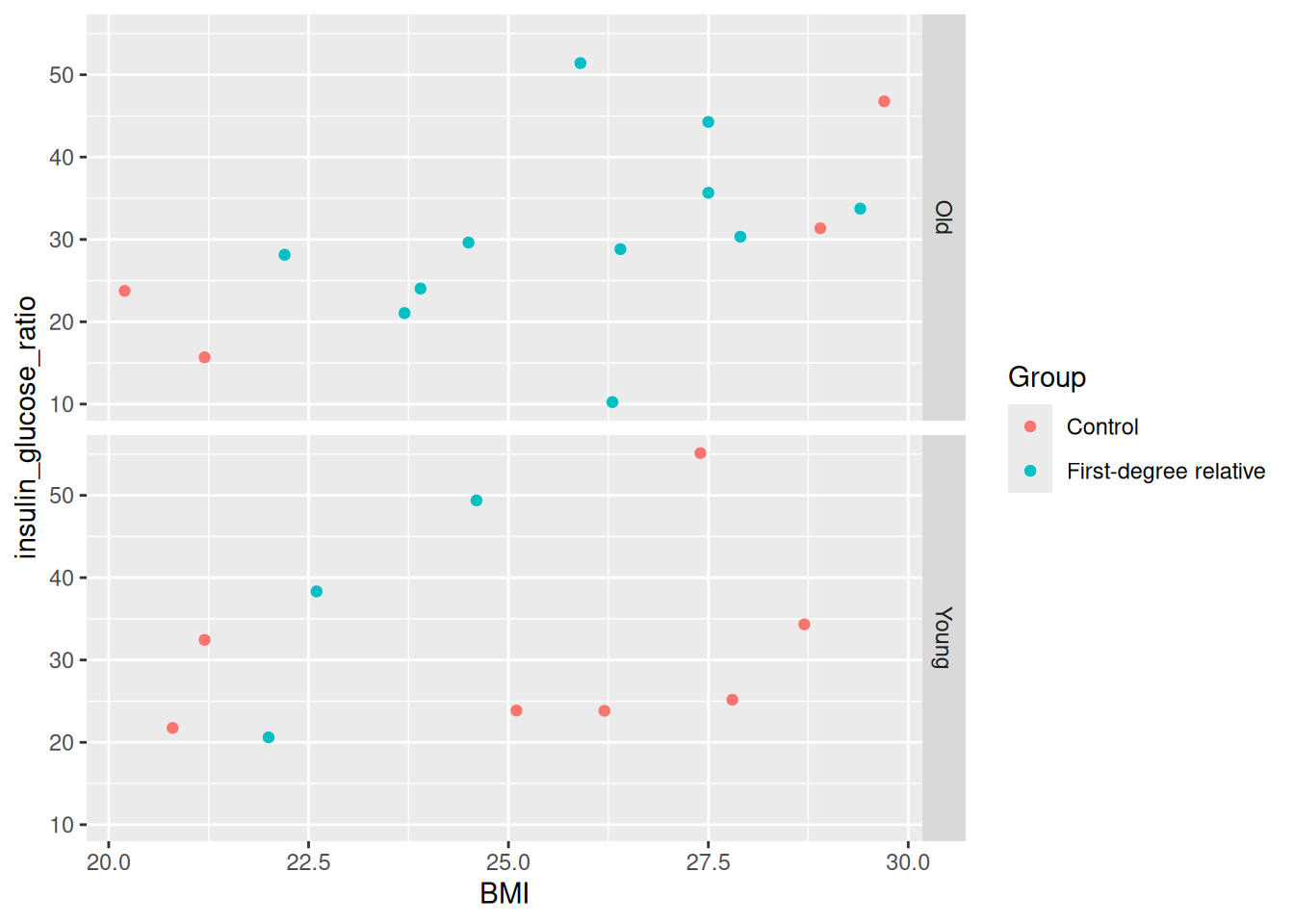
Which do you find more informative?
We can modify the axis labels to have clearer descriptions by using the function labs(). To change the y-axis title, use the y argument in labs(). For the x-axis, it is x. Let’s add x and y axis labels to our existing plot.
docs/learning.qmd
tidied_post_meal_data |>
  filter(BMI < 30) |>
  mutate(young = if_else(Age < 40, "Young", "Old")) |>
  ggplot(aes(x = BMI, y = insulin_glucose_ratio, colour = Group)) +
  geom_point() +
  facet_grid(rows = vars(young)) +
  labs(
    x = "Body mass index (BMI)",
    y = "Insulin to glucose ratio"
  )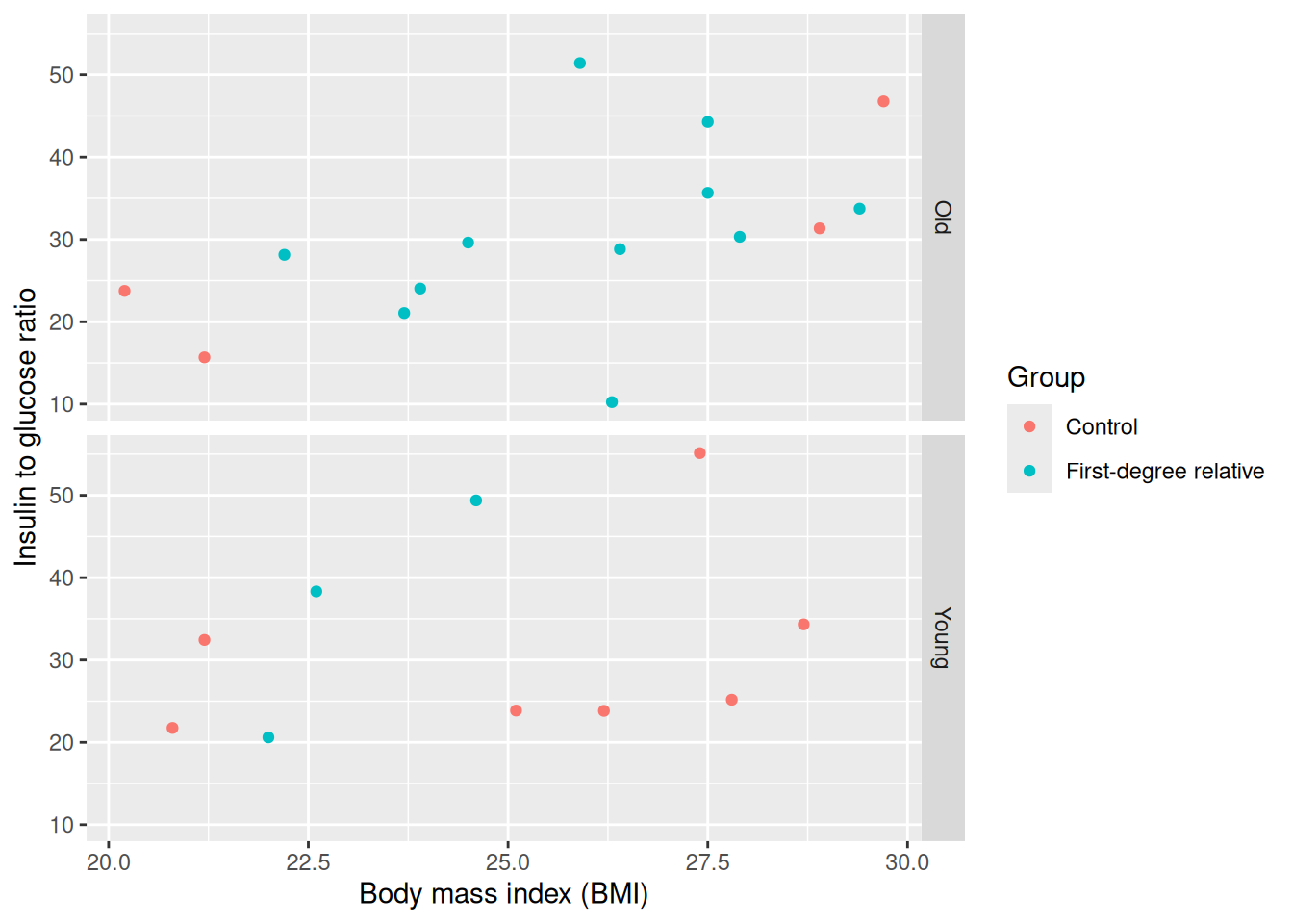
When we run that with Ctrl-EnterCtrl-Enter, we now have labels that are more descriptive!
To save the plot you created, you can use the ggsave() function.
Before moving on, run styler with the Palette (Ctrl-Shift-PCtrl-Shift-P, then type “style file”), render the Quarto document with Ctrl-Shift-KCtrl-Shift-K or with the Palette (Ctrl-Shift-PCtrl-Shift-P, then type “render”), and commit the changes to the Git history with Ctrl-Alt-MCtrl-Alt-M or with the Palette (Ctrl-Shift-PCtrl-Shift-P, then type “commit”). Lastly, push the changes to GitHub.
Time: ~15 minutes.
Time to try this out yourself! Create two figures that are side by side like we did in Chapter 18 with the Quarto code chunk #| layout-ncol: 2. Create a new header in the docs/learning.qmd file called ## Make multi-dimensional plots!, then below it copy and paste the template code chunk shown below into your document.
docs/learning.qmd
```{r}
#| label: fig-multidimensional
#| fig-cap: "Two, mult-dimensional plots of our data."
#| fig-subcap:
#|   - "Distribution of percent body fat by group and age category."
#|   - "Relationship between BMI and bone mineral density, split by insulin sensitivity."
#| layout-ncol: 2
# Task 1.
post_meal_data |>
  mutate(
    ___ = (___ / ___) * 100,
    ___ = if_else(___ < 40, ___, ___)
  ) |>
  ___(___(x = ___, y = ___, colour = ___)) +
  ___(width = 0.2)

# Task 2.
post_meal_data |>
  mutate(
    insulin_glucose_ratio = (auc_ins / auc_pg),
    insulin_insensitive = if_else(___ > ___(___), ___, ___)
  ) |>
  ___(___(x = ___, y = ___)) +
  ___() +
  ___() +
  ___(cols = vars(___))
```percent_body_fat by Group and Age category following these steps:
percent_body_fat that calculates the percentage of body fat by dividing Fat.mass.DXA by Weight and multiplying by 100. You wrote this code previously in another exercise, you can re-use that code if you would like.young that groups people into two categories of being above ("Old") or below ("Young") 40 years of age by using if_else().ggplot() and aes() to create the plot by putting Group on the x-axis, percent_body_fat on the y-axis, and colour the points by young. Use geom_jitter() to show the data points. The argument width = 0.2 has already been set for you to have the points cluster together a bit moreinsulin_glucose_ratio has already been included in the template for you to use. Below this code, create a new column called insulin_insensitive that groups people into two categories of being above ("Insensitive") or below ("Sensitive") the mean() of insulin_glucose_ratio by using if_else().ggplot() and aes() to create the plot by putting BMI on the x-axis, Bone.mineral.DXA on the y-axis, and colour the points by insulin_insensitive.geom_point() to show the data points, then also use geom_smooth() to show a line of best fit.facet_grid() to split the plot by insulin_insensitive.When you complete all the tasks, run styler using the Palette (Ctrl-Shift-PCtrl-Shift-P, then type “style file”), then render the document with Ctrl-Shift-KCtrl-Shift-K or with the Palette (Ctrl-Shift-PCtrl-Shift-P, then type “render”) to make sure it runs and to see the output. End with adding and committing the changes to the Git history with Ctrl-Alt-MCtrl-Alt-M or with the Palette (Ctrl-Shift-PCtrl-Shift-P, then type “commit”) and pushing the changes to GitHub.
# This is an example of what the code will look like:
#| label: fig-multidimensional
#| fig-cap: "Two, mult-dimensional plots of our data."
#| fig-subcap:
#|   - "Distribution of percent body fat by group and age category."
#|   - "Relationship between BMI and bone mineral density, split by insulin sensitivity."
#| layout-ncol: 2
# Task 1.
post_meal_data |>
  mutate(
    percent_body_fat = (Fat.mass.DXA / Weight) * 100,
    young = if_else(Age < 40, "Young", "Old")
  ) |>
  ggplot(aes(x = Group, y = percent_body_fat, colour = young)) +
  geom_jitter(width = 0.2)

# Task 2.
post_meal_data |>
  mutate(
    insulin_glucose_ratio = (auc_ins / auc_pg),
    insulin_insensitive = if_else(insulin_glucose_ratio > mean(insulin_glucose_ratio), "Insensitive", "Sensitive")
  ) |>
  ggplot(aes(x = BMI, y = Bone.mineral.DXA, colour = insulin_insensitive)) +
  geom_point() +
  geom_smooth() +
facet_grid(cols = vars(insulin_insensitive))When you’re ready to continue, place the paper hat on your computer to indicate this to the teacher 👒 🎩
Time: ~5 minutes
Colour blindness is common in the general population, with red-green colour blindness affecting about 8% of men and 0.5% of women. To make your graph more accessible to people with colour blindness, you need to consider the colours you use. For more detail on how colours look to those with colour blindness, check out this documentation from the viridis package.
The viridis colour scheme (also developed as an R package) was specifically designed to represent data to all colour visions (including as a grayscale, e.g. from black to white). There is a really informative talk on YouTube on this topic.
When using colours, think about what you are trying to convey in your figure and how your choice of colours will be interpreted. You can use built-in colour schemes or create your own. For now, let’s stick to using built-in ones. There are two we can start with: the viridis and the ColorBrewer colour schemes. Both are well designed and are colour blind friendly. For this workshop, we will only cover the viridis package.
You can modify ggplot2 colour schemes using many other pre-defined palettes by installing new R packages, including scientific journal colour palettes (ggsci) and even a Wes Anderson (wesanderson) or a Stubio Ghibli (ghibli) colour palette!
Continue to the exercise once you’ve finished reading this section to test out the viridis colour scheme.
Time: ~8 minutes.
Change the colour schemes on some plots. Start with a base plot object to work from that has two discrete variables. Create a new Markdown header called ## Changing colours and create a new code chunk below it using Ctrl-Alt-ICtrl-Alt-I or with the Palette (Ctrl-Shift-PCtrl-Shift-P, then type “new chunk”). Copy and paste the code below into the new code chunk.
# Tasks 1. and 2.
post_meal_data |>
  mutate(hyperglycemia = if_else(glykemi == 1, "Yes", "No")) |>
  ggplot(aes(x = Group, fill = hyperglycemia)) +
  geom_bar(position = position_dodge()) +
  ___()

# Tasks 3. and 4.
post_meal_data |>
  ggplot(aes(x = auc_pg, y = auc_ins, colour = BMI)) +
  geom_point() +
___()If you need help, use the help() or ? functions in RStudio to look over the documentation for more information for the functions we get you to use below.
Change the colour to the viridis scheme by using the scale_fill_viridis_d() function, adding it to the end of the # Task 1. and 2. code. Because the variables are discrete, the function ends with _d.
viridis has several palettes. Add the argument option = "magma" to the scale_fill_viridis_d() function. Run the function again and see how the colour changes. Then, change "magma" to "cividis".
Now, let’s practice using the colour schemes on a plot with continuous variables. For the # Tasks 3. and 4. code, use scale_colour_viridis_c() at the end of the ggplot() function. We use _colour_ instead of _fill_ in the scale_ name because, well, we are using the colour = argument. The _c at the end indicates the variable are continuous.
Similar to task 2 above, use the option = "inferno" argument to set the palette and see how the colour changes. Select which colour scheme you would like.
Once you are done, style your code with styler using the Palette (Ctrl-Shift-PCtrl-Shift-P, then type “style file”), render the document with Ctrl-Shift-KCtrl-Shift-K or with the Palette (Ctrl-Shift-PCtrl-Shift-P, then type “render”), and commit the changes to the Git history with Ctrl-Alt-MCtrl-Alt-M or with the Palette (Ctrl-Shift-PCtrl-Shift-P, then type “commit”), followed by pushing to GitHub.
# Tasks 1. and 2.
post_meal_data |>
  mutate(hyperglycemia = if_else(glykemi == 1, "Yes", "No")) |>
  ggplot(aes(x = Group, fill = hyperglycemia)) +
  geom_bar(position = position_dodge()) +
  scale_fill_viridis_d()
# scale_fill_viridis_d(option = "magma")

# Tasks 3. and 4.
post_meal_data |>
  ggplot(aes(x = auc_pg, y = auc_ins, colour = BMI)) +
  geom_point() +
  scale_colour_viridis_c()
# scale_colour_viridis_c(option = "inferno")When you’re ready to continue, place the paper hat on your computer to indicate this to the teacher 👒 🎩
|> the output of your wrangling directly into making a plot to streamline your code.geom_jitter(), geom_boxplot(), or geom_violin() to show the relationship between a continuous and a discrete variable.facet_grid().Please complete the survey for this session:
This lists some, but not all, of the code used in the section. Some code is incorporated into Markdown content, so is harder to automatically list here in a code chunk. The code below also includes the code from the exercises.
tidied_post_meal_data |>
  mutate(overweight = if_else(BMI >= 25, "Overweight", "Not overweight")) |>
  ggplot(aes(x = overweight, y = insulin_glucose_ratio)) +
  geom_jitter()
tidied_post_meal_data |>
  filter(BMI < 30) |>
  ggplot(aes(x = Age, y = auc_insulin, colour = Group)) +
  geom_point()
tidied_post_meal_data |>
  filter(BMI < 30) |>
  mutate(young = if_else(Age < 40, "Young", "Old")) |>
  ggplot(aes(x = BMI, y = insulin_glucose_ratio, colour = Group)) +
  geom_point() +
  facet_grid(cols = vars(young))
tidied_post_meal_data |>
  filter(BMI < 30) |>
  mutate(young = if_else(Age < 40, "Young", "Old")) |>
  ggplot(aes(x = BMI, y = insulin_glucose_ratio, colour = Group)) +
  geom_point() +
  facet_grid(rows = vars(young))
tidied_post_meal_data |>
  filter(BMI < 30) |>
  mutate(young = if_else(Age < 40, "Young", "Old")) |>
  ggplot(aes(x = BMI, y = insulin_glucose_ratio, colour = Group)) +
  geom_point() +
  facet_grid(rows = vars(young)) +
  labs(
    x = "Body mass index (BMI)",
    y = "Insulin to glucose ratio"
  )
# This is an example of what the code will look like:
#| label: fig-multidimensional
#| fig-cap: "Two, mult-dimensional plots of our data."
#| fig-subcap:
#|   - "Distribution of percent body fat by group and age category."
#|   - "Relationship between BMI and bone mineral density, split by insulin sensitivity."
#| layout-ncol: 2
# Task 1.
post_meal_data |>
  mutate(
    percent_body_fat = (Fat.mass.DXA / Weight) * 100,
    young = if_else(Age < 40, "Young", "Old")
  ) |>
  ggplot(aes(x = Group, y = percent_body_fat, colour = young)) +
  geom_jitter(width = 0.2)

# Task 2.
post_meal_data |>
  mutate(
    insulin_glucose_ratio = (auc_ins / auc_pg),
    insulin_insensitive = if_else(insulin_glucose_ratio > mean(insulin_glucose_ratio), "Insensitive", "Sensitive")
  ) |>
  ggplot(aes(x = BMI, y = Bone.mineral.DXA, colour = insulin_insensitive)) +
  geom_point() +
  geom_smooth() +
  facet_grid(cols = vars(insulin_insensitive))
# Tasks 1. and 2.
post_meal_data |>
  mutate(hyperglycemia = if_else(glykemi == 1, "Yes", "No")) |>
  ggplot(aes(x = Group, fill = hyperglycemia)) +
  geom_bar(position = position_dodge()) +
  scale_fill_viridis_d()
# scale_fill_viridis_d(option = "magma")

# Tasks 3. and 4.
post_meal_data |>
  ggplot(aes(x = auc_pg, y = auc_ins, colour = BMI)) +
  geom_point() +
  scale_colour_viridis_c()
# scale_colour_viridis_c(option = "inferno")