doc/learning.qmd
nhanes_small %>%
  ggplot(aes(x = bmi)) +
  geom_histogram()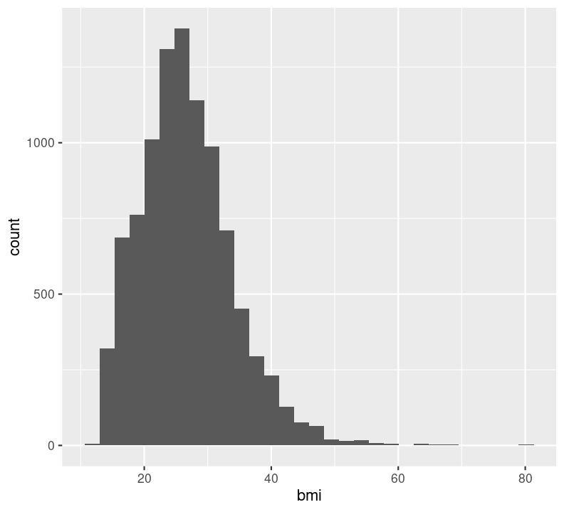
Session objectives:
Very often you want to get a sense of your data, one variable (i.e. column in a data frame) at a time. You create plots to see the distribution of a variable and visually inspect the data for any problems. There are several ways of plotting continuous variables like age or BMI in ggplot2. For discrete variables like education status, there is really only one way.
You may notice that, since the Data Wrangling session (Chapter 7), we have been using the term “column” to describe the columns in the data frame, but from this point forward, we will instead refer to them as “variable”. There’s a reason for this: ggplot2 really only works with tidy data. If we recall the definition of tidy data, it consists of “variables” (columns) and “observations” (rows) of a data frame. To us, a “variable” is something that we are interested in analyzing or visualizing, and which only contains values relevant to that measurement (e.g. age variable must only contain values for age).
The NHANES dataset is already pretty tidy. Rows are participants at the survey year and columns are the variables that were measured. Let’s visually explore our data. In the LearningR project in the doc/learning.qmd file, create a new second-level header on the bottom of the file called ## Visualizing data. Now, we are ready to start creating the first plot!
Since BMI is a strong risk factor for diabetes, let’s check out the distribution of BMI among the participants. There are two good geoms for examining distributions for continuous variables: geom_density() and geom_histogram(). How you use both is the same, so we will only show the histogram geom.
Write out a new header called ### One variable plots in the free text area. Below it add a code chunk with Ctrl-Alt-ICtrl-Alt-I or with the Palette (Ctrl-Shift-PCtrl-Shift-P, then type “new chunk”). To make use of auto-completion and to get used to using the pipe, we’ll pipe the data into the ggplot() function.
doc/learning.qmd
nhanes_small %>%
ggplot(aes(x = bmi)) +
geom_histogram()
You’ll notice we get a warning about dropping missing values. That’s ggplot2 letting us know we have some missing values. So, like with median() and many of the other summary statistic functions, we can set na.rm = TRUE to geom_histogram() and other geom_* functions.
doc/learning.qmd
nhanes_small %>%
  ggplot(aes(x = bmi)) +
  geom_histogram(na.rm = TRUE)
Note that it is good practice to always create a new line after the +. Our plot shows that, for the most part, there is a good distribution with BMI, although there are several values that are quite large, including some at 80 BMI units! Let’s use dplyr functions to remove anything above 60. Because we are piping the results into ggplot(), we can use aes() right away rather than put in the data object to the first argument position.
doc/learning.qmd
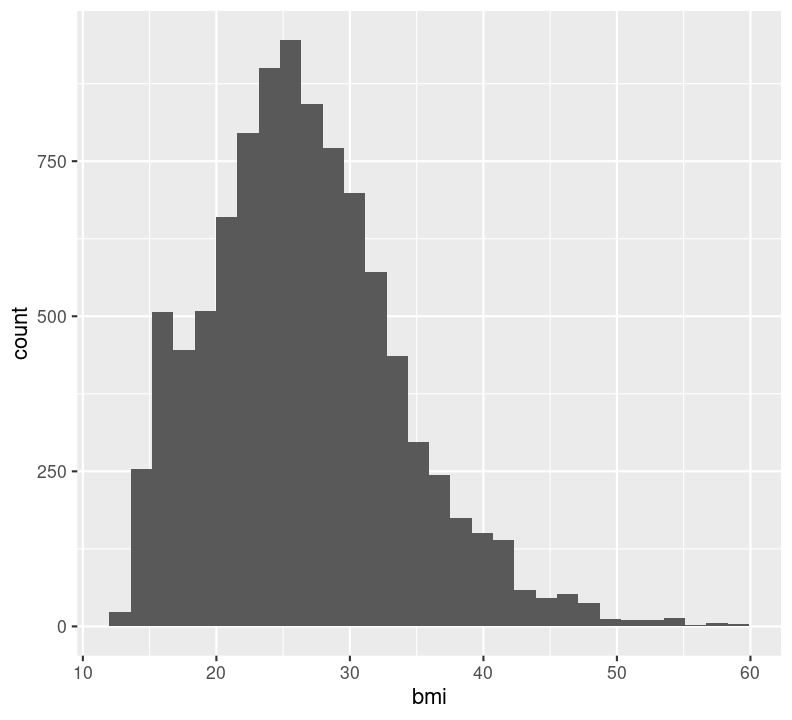
In general, it is good practice to create a new code chunk for each plot in Quarto for several reasons. One, it makes it easier to maintain a nice readable code and, two, there are some chunk options that only work with one figure. However, it is possible to show multiple graphs for instance side-by-side, as we will do later. Now we add a caption for the plot with the option#| fig-cap. Let’s add one as well as a figure label with #| label so we can reference it in the text by using @fig-LABEL. Figure labels must always start with fig-.
```{r}
#| fig-cap: "Distribution of BMI."
#| label: fig-bmi-histo
nhanes_small %>%
  filter(bmi <= 60) %>%
  ggplot(aes(x = bmi)) +
  geom_histogram(na.rm = TRUE)
```
Now when we reference the figure in the text, we can use @fig-bmi-histo, to look like this: Figure 9.1.
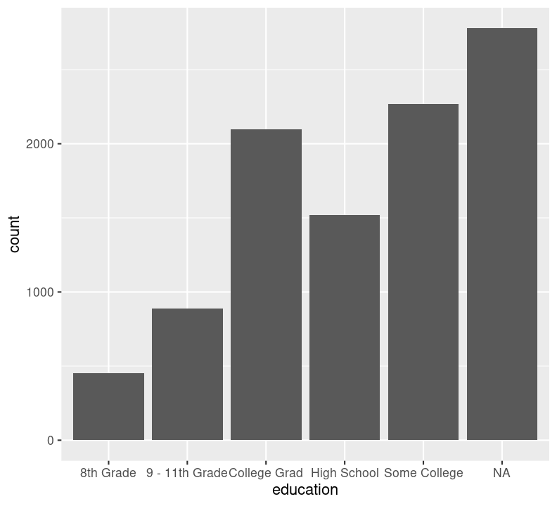
The geoms above are appropriate for plotting continuous variables, but what about plotting discrete variables? Well, sadly, there’s really only one: geom_bar(). This isn’t a geom for a barplot though; instead, it shows the counts of a discrete variable. There are many discrete variables in NHANES, including education and diabetes, so let’s use this geom to visualize those. Again, create a new code chunk with Ctrl-Alt-ICtrl-Alt-I or with the Palette (Ctrl-Shift-PCtrl-Shift-P, then type “new chunk”) and type:
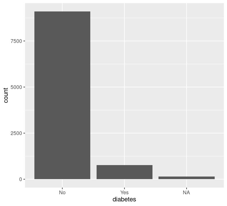
We can’t use na.rm = TRUE here because geom_bar() includes that information as a bar. We can see that the number of people in progressively higher education statuses steadily increases, but there’s also a lot of missingness shown in the NA column. Now, we’ll do the same for the diabetes status variable. In the same code chunk, type:
For diabetes, it seems that there is some missingness in the data. Same thing with education. Like we did with the BMI, we’ll use filter() to drop those missing rows right before plotting them. First create a new code chunk with Ctrl-Alt-ICtrl-Alt-I or with the Palette (Ctrl-Shift-PCtrl-Shift-P, then type “new chunk”). Then we’ll start with diabetes and then copy and paste the code, replacing diabetes with education.
doc/learning.qmd
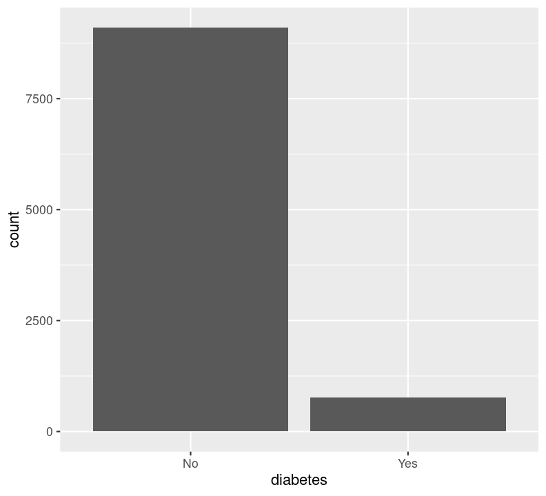

We are plotting two figures here. With Quarto, we can arrange them side by side in the output document by using the #| layout-ncol (or #| layout-nrow or #| layout), described more in Quarto’s Figures page. We can then combine it with captions and sub-captions using #| fig-subcap to have a nice output!
```{r}
#| label: fig-diabetes-education
#| fig-cap: "Counts of Diabetes and Education."
#| fig-subcap:
#| - "Number of those with or without Diabetes."
#| - "Number of those with different educational status."
#| layout-ncol: 2
nhanes_small %>%
  filter(!is.na(diabetes)) %>%
  ggplot(aes(x = diabetes)) +
  geom_bar()
nhanes_small %>%
  filter(!is.na(education)) %>%
  ggplot(aes(x = education)) +
  geom_bar()
```
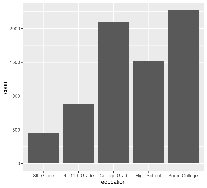
Render the document with Ctrl-Shift-KCtrl-Shift-K or with the Palette (Ctrl-Shift-PCtrl-Shift-P, then type “render”) to see what it looks like! Neat eh 😀
Before continuing with plotting, let’s take a minute to talk about a commonly used barplots with mean and error bars. In all cases, barplots should only be used for discrete (categorical) data where you want to show counts or proportions. As a general rule, they should not be used for continuous data. This is because the commonly used “bar plot of means with error bars” actually hides the underlying distribution of the data. To have a better explanation of this, you can read the article on why to avoid barplots after the course. The image below was taken from that paper, and briefly demonstrates why this plot type is not useful.
If you do want to create a barplot, you’ll quickly find out that it is actually quite hard to do in ggplot2. The reason it is difficult to create in ggplot2 is by design: it’s a bad plot to use, so use something else.
Before we move on, let’s run styler using the Palette (Ctrl-Shift-PCtrl-Shift-P, then type “style file”), then add and commit the new files we created into the Git history with Ctrl-Alt-MCtrl-Alt-M or with the Palette (Ctrl-Shift-PCtrl-Shift-P, then type “commit”) and push up to your GitHub repository.
There are many more types of “geoms” to use when plotting two variables. Your choice of which one to use depends on what you are trying to show or communicate, and the nature of the data. Usually, the variable that you “control or influence” (the independent variable) in an experimental setting goes on the x-axis, and the variable that “responds” (the dependent variable) goes on the y-axis.
When you have two continuous variables, some geoms to use are:
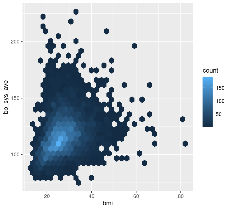
geom_hex(), which is used to replace geom_point() when your data are massive and creating points for each value takes too long to plot. Because we have a lot of data, we will show this one.geom_point(), which is used to create a standard scatterplot. You’ll use this one in the exercise, it is used the same way as other geoms.geom_smooth(), which applies a “regression-type” line to the data (default uses LOESS regression).Let’s check out how BMI may influence systolic blood pressure using a hex plot in a new code chunk. First, enter a new Markdown header called ### Plotting two variables and create a new code chunk below the header with Ctrl-Alt-ICtrl-Alt-I or with the Palette (Ctrl-Shift-PCtrl-Shift-P, then type “new chunk”). Like with the previous plot we created using bmi, we’ll use na.rm again.
Notice how the hex plot changes the colour of the data based on how many values are in the area of the plot. We can also draw a smoothing line by adding to the plot by using +.
nhanes_small %>%
  ggplot(aes(x = bmi, y = bp_sys_ave)) +
geom_hex(na.rm = TRUE) +
geom_smooth(na.rm = TRUE)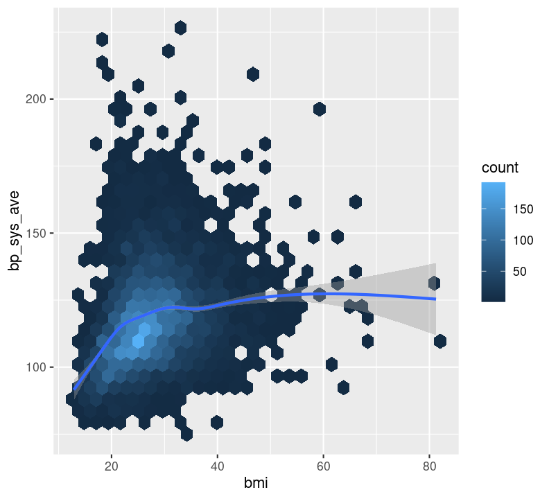
This makes a nice smoothing line through the data and gives us an idea of general trends or relationships between the two variables.
Sadly, there are not many options available for plotting two discrete variables, without major data wrangling. The most useful geom for this type of plot is geom_bar(), but with an added variable. We can use the geom_bar() “fill” option to have a certain colour for different levels of a variable. Let’s use this to see difference in diabetes status between education levels. Create a new code chunk with Ctrl-Alt-ICtrl-Alt-I or with the Palette (Ctrl-Shift-PCtrl-Shift-P, then type “new chunk”). We’ll have to remove the NA values. We can use dplyr verbs here, as well as using the %>% pipe into ggplot().
doc/learning.qmd
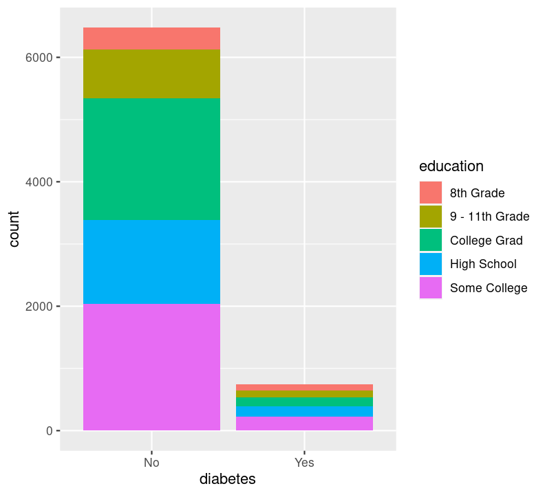
By default, geom_bar() will make “fill” groups stacked on top of each other. In this case, it isn’t really that useful, so let’s change them to be sitting side by side. For that, we need to use the position argument with a function called position_dodge(). This new function takes the “fill” grouping variable and “dodges” them (moves them) to be side by side.
doc/learning.qmd
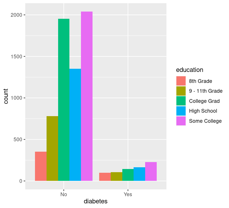
Now you can see that there are differences between education and those who have diabetes.
When the variable types are mixed (continuous and discrete), there are many more geoms available to use. A couple of good ones are:
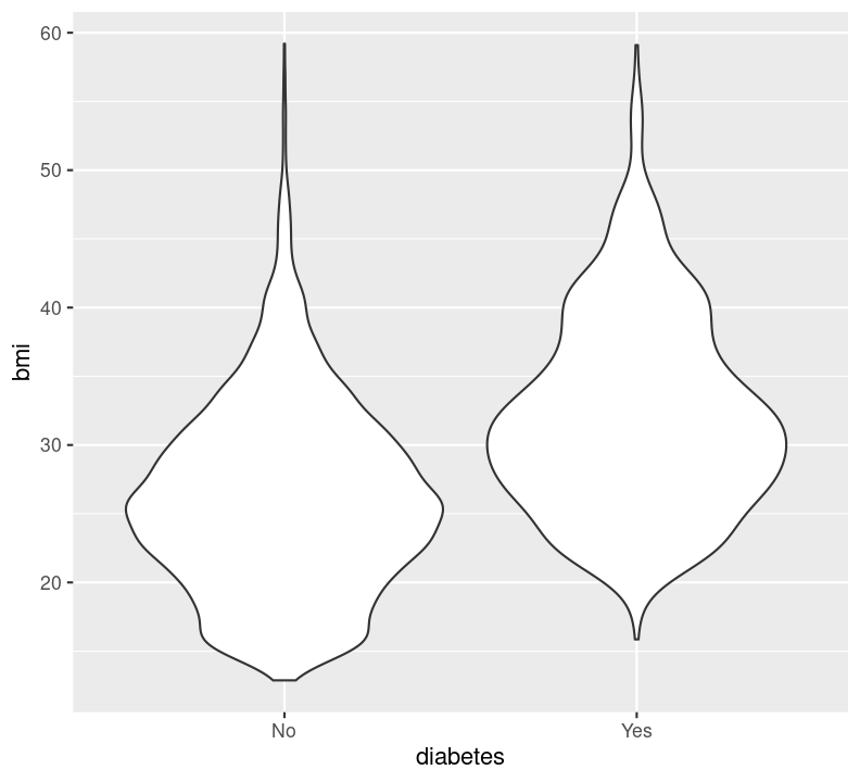
geom_boxplot(), which makes boxplots that show the median and a measure of range in the data. Boxplots are generally pretty good at showing the spread of data. However, like the discuss about “bar plots”, boxplots can still hide your actual data. It is generally fine to use, but a better geom might be jitter or voilin.geom_jitter(), which makes a type of scatterplot, but for discrete and continuous variables. A useful argument to geom_jitter() is width, which controls how wide the jittered points span from the center line. This plot is much better than the boxplot since it shows the actual data, and not summaries like a boxplot does. However, it is not very good when you have lots of data points.geom_violin(), which shows a density distribution like geom_density(). This geom is great when there is a lot of data and geom_jitter() may otherwise appear as a mass of dots.The way you use any of these geoms is the same. If you use one, you can use another. So we’ll show how to use geom_voilin(), because our data are quite big.
Let’s take a look at these geoms, by plotting how BMI differs between those with or without diabetes. Create a new code chunk with Ctrl-Alt-ICtrl-Alt-I or with the Palette (Ctrl-Shift-PCtrl-Shift-P, then type “new chunk”) and type:
doc/learning.qmd
Before proceeding with the following exercise, take a moment to run styler with the Palette (Ctrl-Shift-PCtrl-Shift-P, then type “style file”), render with Ctrl-Shift-KCtrl-Shift-K or with the Palette (Ctrl-Shift-PCtrl-Shift-P, then type “render”), add and commit changes to the Git history using Ctrl-Alt-MCtrl-Alt-M or with the Palette (Ctrl-Shift-PCtrl-Shift-P, then type “commit”), and then push to Github. Also, notice the document outline now has a nice index of how to plot the different data types!
Time: 20 minutes.
Create a new header in the doc/learning.qmd file called ## Exercise to make plots with one or two variables. For each task below, create a new code chunk for it using Ctrl-Alt-ICtrl-Alt-I or with the Palette (Ctrl-Shift-PCtrl-Shift-P, then type “new chunk”). Copy and paste the template code shown in each task into its own code chunk. When you complete each task, run styler using the Palette (Ctrl-Shift-PCtrl-Shift-P, then type “style file”) and render the document with Ctrl-Shift-KCtrl-Shift-K or with the Palette (Ctrl-Shift-PCtrl-Shift-P, then type “render”) to make sure it works and to see the output.
Complete as many tasks as you can below.
Start with the original NHANES dataset to have access to more variables.
doc/learning.qmd
library(NHANES)
nhanes_exercise <- NHANES %>%
  rename_with(snakecase::to_snake_case) %>%
  rename(sex = gender)
With the nhanes_exercise data, use geom_density() to show the distribution of age (participant’s age at collection) and diabetes_age (age of diabetes diagnosis) in two separate, side-by-side plots, but inside one code chunk. Use #| layout-ncol, along with #| label, #| fig-cap and #| fig-subcap, to have the two plots be side by side. Don’t forget to use na.rm = TRUE in the geom.
#| ___: ___
#| ___: ___
#| ___: ___
#| ___:
#|   - ___
#|   - ___
# Distribution of age
nhanes_exercise %>%
  ggplot(aes(x = ___)) +
    ___(___ = ___)

# Distribution of age at diabetes diagnosis
nhanes_exercise %>%
  ggplot(aes(x = ___)) +
    ___(___ = ___)
Click for the solution. Only click if you are struggling or are out of time.
```{r solution-distribution-ages}
#| eval: false
# These are approximate caption titles
#| label: fig-distribution-ages
#| fig-cap: "Distribution of different age variables"
#| layout-ncol: 2
#| fig-subcap:
#|   - "Age at collection"
#|   - "Age of diabetes diagnosis"
# Distribution of age
nhanes_exercise %>%
  ggplot(aes(x = age)) +
  geom_density(na.rm = TRUE)

# Distribution of age at diabetes diagnosis
nhanes_exercise %>%
  ggplot(aes(x = diabetes_age)) +
  geom_density(na.rm = TRUE)
```
With nhanes_exercise, use filter() and geom_bar() to find out how many people there who currently smoke (smoke_now) and who are at or above the age or 20. Drop missing values (!is.na()) from smoke_now. What can you say about how many smoke in this age group? Use #| label and #| fig-cap to be able to reference it in the Quarto document and have a caption. Render the document using Ctrl-Shift-KCtrl-Shift-K or with the Palette (Ctrl-Shift-PCtrl-Shift-P, then type “render”) to make sure it works and to see the output.
# Number of people who smoke now and are or above 20 years of age,
# removing those with missing smoking status.
nhanes_exercise %>%
  ___(___ >= ___, !is.na(___)) %>%
  ggplot(aes(x = ___)) +
___()Mean arterial pressure is a blood pressure measure used to determine the average pressure arteries experience through a typical cardiac cycle. The formula to calculate it is:
\[(Systolic + (2 \times Diastolic) / 3)\]
Use mutate() to create a new column called mean_arterial_pressure using this formula above. The code template below will help you start out. Then, use geom_hex() and add another layer for geom_smooth() to find out how bmi (on the x-axis) relates to mean_arterial_pressure (on the y-axis). Do you notice anything about the data from the plots?
# BMI in relation to mean arterial pressure
nhanes_exercise %>%
  ___(___ = (___ + (2 * ___)) / 3) %>%
  ggplot(aes(x = ___, y = ___)) +
  ___(na.rm = TRUE) +
___()End with adding and committing the changes to the Git history with Ctrl-Alt-MCtrl-Alt-M or with the Palette (Ctrl-Shift-PCtrl-Shift-P, then type “commit”).
There are many ways to visualize additional variables in a plot and further explore your data. For that, we can use ggplot2’s colour, shape, size, transparency (“alpha”), and fill aesthetics, as well as “facets”. Faceting in ggplot2 is a way of splitting the plot up into multiple plots when the underlying aesthetics are the same or similar. In this section, we’ll be covering many of these capabilities in ggplot2.
The most common and “prettiest” way of adding a third variable is by using colour. Let’s try to answer a few of the questions below, to visualize some of these features. First, create a new header called ## Plotting three or more variables and a new code chunk with Ctrl-Alt-ICtrl-Alt-I or with the Palette (Ctrl-Shift-PCtrl-Shift-P, then type “new chunk”).
Question: Is systolic blood pressure different in those with or without diabetes within different education groups? In this case, we have one continuous variable (bp_sys_ave) and two discrete variables (education and diabetes). To plot this, we could use geom_boxplot():
doc/learning.qmd
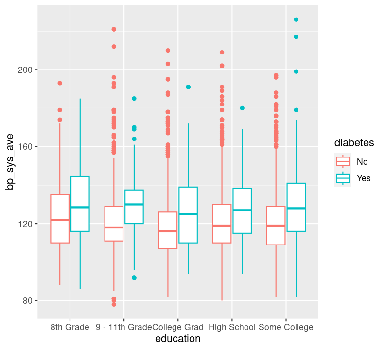
Do you see differences in systolic blood pressure between the education statuses? Between diabetics and non-diabetics?
Question: How does BMI relate to systolic blood pressure and age? Here, we have three continuous variables (bmi, bp_sys_ave, and age), so we could use geom_point():
doc/learning.qmd
nhanes_small %>%
  ggplot(aes(x = bmi, y = bp_sys_ave, colour = age)) +
  geom_point(na.rm = TRUE)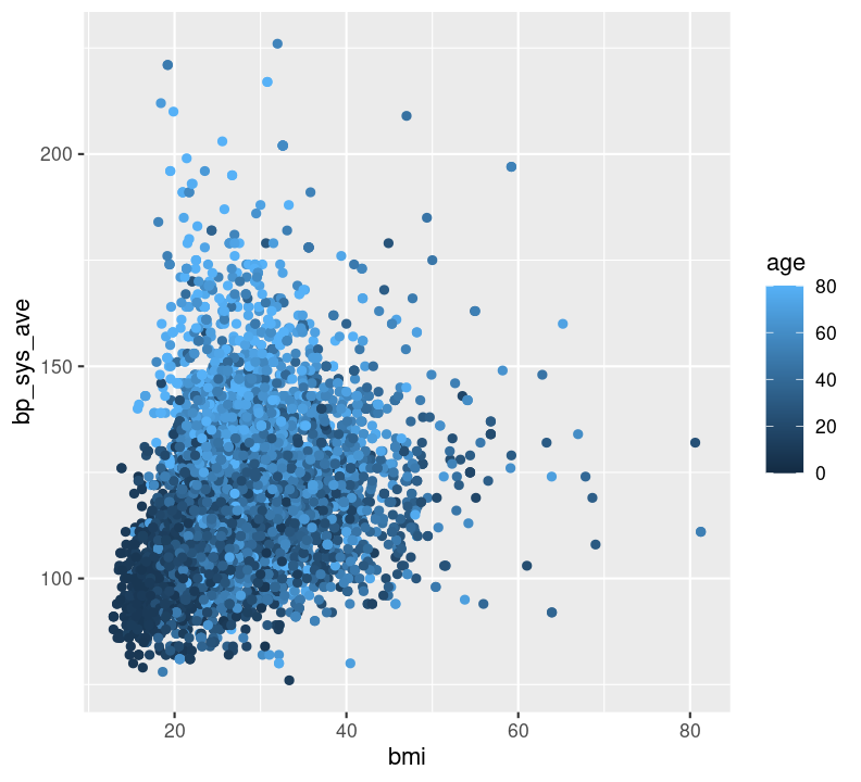
Can you see any associations between systolic blood pressure and BMI or age?
Question: How does BMI relate to systolic blood pressure, and what is different between those with and without diabetes? In this case, we have two continuous variables (bmi and bp_sys_ave) and one discrete variable (diabetes). We could use geom_point(), making sure to also filter() those missing diabetes values.
doc/learning.qmd
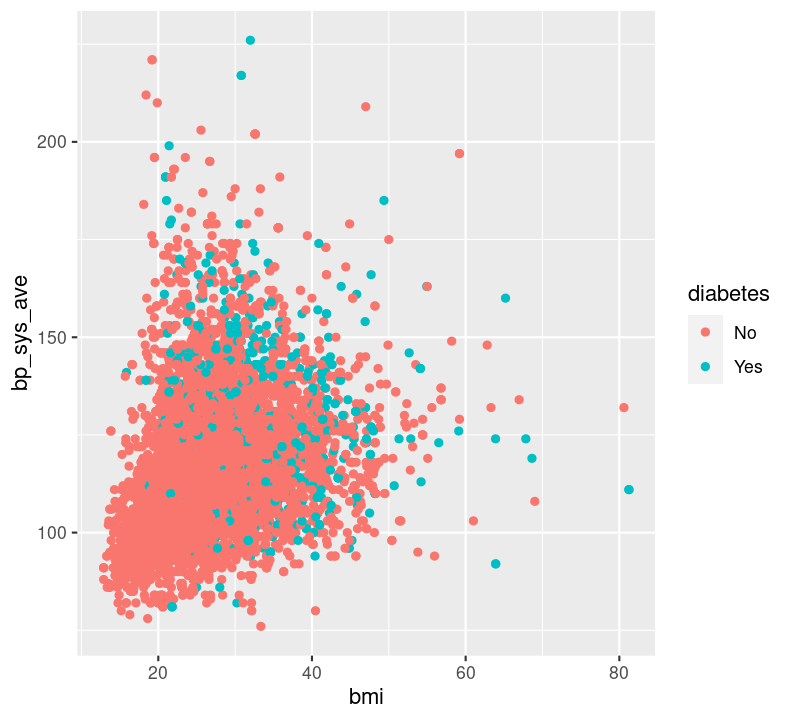
For this latter plot, it’s really hard to see what’s different. But there is another way of visualizing a third (or fourth, and fifth) variable: with “faceting”! Faceting splits the plot up into multiple subplots using the function facet_grid(). For faceting to work, at least one of the first two arguments to facet_grid() is needed. The first two arguments are:
cols: The discrete variable to use to facet the plot column-wise (i.e. side-by-side).rows: The discrete variable to use to facet the plot row-wise (i.e. stacked on top of each other).For both cols and rows, the nominated variable must be wrapped by vars() (e.g. vars(diabetes)). Let’s try it using an example from the previous answer (instead of using colour). Make a new code chunk with Ctrl-Alt-ICtrl-Alt-I or with the Palette (Ctrl-Shift-PCtrl-Shift-P, then type “new chunk”) at the bottom of the file.
doc/learning.qmd
nhanes_small %>%
  filter(!is.na(diabetes)) %>%
  ggplot(aes(x = bmi, y = bp_sys_ave)) +
  geom_point(na.rm = TRUE) +
  facet_grid(cols = vars(diabetes))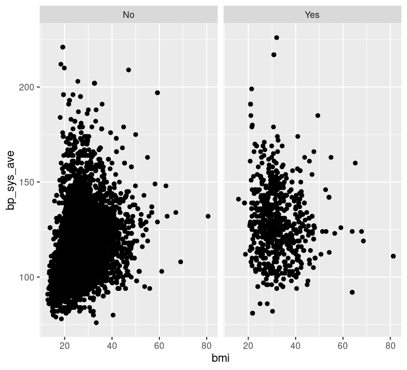
Try faceting with plots stacked by diabetes status, using the argument rows = vars(diabetes) instead. Which do you find more informative?
doc/learning.qmd
nhanes_small %>%
  filter(!is.na(diabetes)) %>%
  ggplot(aes(x = bmi, y = bp_sys_ave)) +
  geom_point(na.rm = TRUE) +
  facet_grid(rows = vars(diabetes))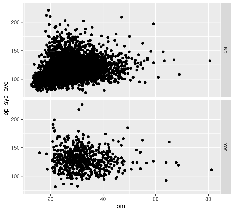
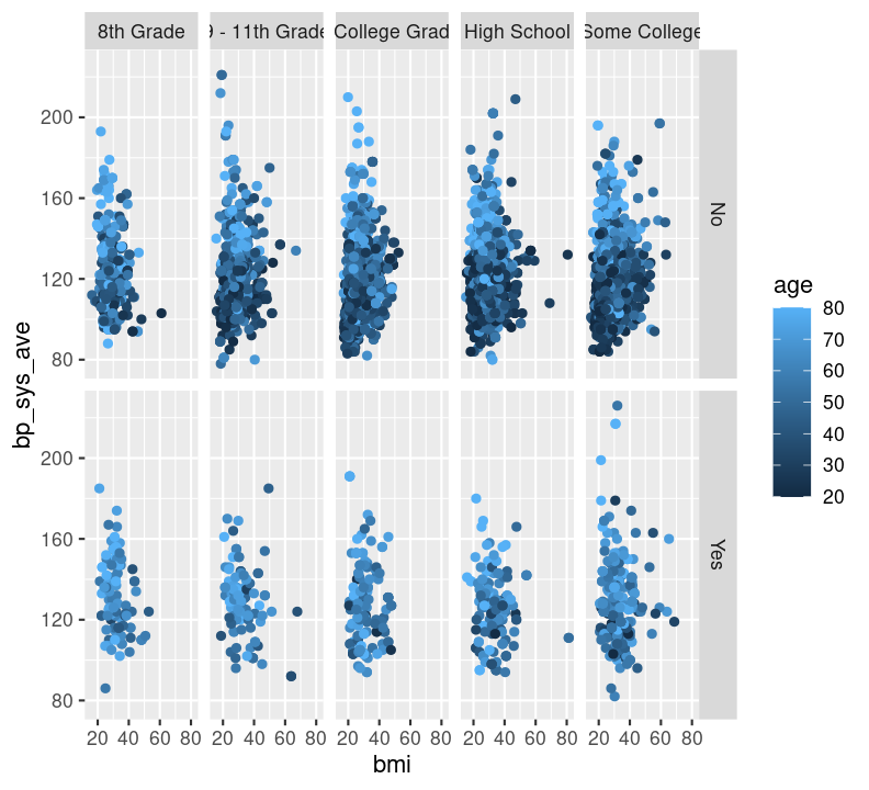
We can also facet by education and use age as a colour. We’ll have to filter() out those missing education values.
doc/learning.qmd
Before moving on, run styler with the Palette (Ctrl-Shift-PCtrl-Shift-P, then type “style file”) and then add and commit the new changes to the Git history with Ctrl-Alt-MCtrl-Alt-M or with the Palette (Ctrl-Shift-PCtrl-Shift-P, then type “commit”), and push to GitHub.
Time: 10 minutes.
Practice changing colour schemes on a bar plot. Start with a base plot object to work from that has two discrete variables. Create a new Markdown header called ## Exercise for changing colours and create a new code chunk below it using Ctrl-Alt-ICtrl-Alt-I or with the Palette (Ctrl-Shift-PCtrl-Shift-P, then type “new chunk”). Copy and paste the code below into the new code chunk.
# Barplot to work from, with two discrete variables
nhanes_small %>%
  filter(!is.na(diabetes), !is.na(education)) %>%
  ggplot(aes(x = diabetes, fill = education)) +
  geom_bar(position = position_dodge()) +
  ___
Use the scale_fill_ function set to add the colour scheme. If you need help, use the help() or ? functions in RStudio to look over the documentation for more information or to see the other scale_ functions. Use tab auto-completion to find the correct function.
Change the colour to the viridis scheme with the scale_fill_viridis_d() function, added to the end of the ggplot2 code so that the plot is colour blind friendly. Because the variables are discrete, you will need to add _d to the end of the viridis function.
viridis has several palettes. Add the argument option = "magma" to the scale_fill_viridis_d() function. Run the function again and see how the colour changes. Then, change "magma" to "cividis".
Now, let’s practice using the colour schemes on a plot with continuous variables. Copy and paste the code below into the code chunk. Since we are using colour instead of fill, the scale_ will be scale_colour_viridis_c(). The _c at the end indicates the variable are continuous.
# Scatterplot to work from, with three continuous variables
nhanes_small %>%
  ggplot(aes(x = bmi, y = bp_sys_ave, colour = age)) +
  geom_point(na.rm = TRUE) +
  scale_
Similar to task 2 above, use the option argument to set the palette to "inferno" and see how the colour changes. Select which colour scheme you would like.
Run styler using the Palette (Ctrl-Shift-PCtrl-Shift-P, then type “style file”). Then commit the changes to the Quarto file into the Git history with Ctrl-Alt-MCtrl-Alt-M or with the Palette (Ctrl-Shift-PCtrl-Shift-P, then type “commit”).
# 1. and 2.
nhanes_small %>%
  filter(!is.na(diabetes), !is.na(education)) %>%
  ggplot(aes(x = diabetes, fill = education)) +
  geom_bar(position = position_dodge()) +
  scale_fill_viridis_d()
  # scale_fill_viridis_d(option = "magma")

# 3.
nhanes_small %>%
  ggplot(aes(x = bmi, y = bp_sys_ave, colour = age)) +
  geom_point(na.rm = TRUE) +
  scale_colour_viridis_c()
# scale_colour_viridis_c(option = "inferno")There are so many options in RStudio to modify a ggplot2 figure. Almost all of them are found in the theme() function. We won’t cover individual theme items, since the ?theme help page and ggplot2 theme webpage already document theme() really well. Instead, we’ll cover a few of the built-in themes, as well as setting the axes labels and plot title. We’ll create base graph object to work with created base_scatterplot. All built-in themes start with theme_.
Create a new section header called ## Changing plot appearance and make a new code chunk with Ctrl-Alt-ICtrl-Alt-I or with the Palette (Ctrl-Shift-PCtrl-Shift-P, then type “new chunk”), then copy the code below:
doc/learning.qmd
base_scatterplot <- nhanes_small %>%
  filter(!is.na(diabetes), !is.na(education)) %>%
  ggplot(aes(x = bmi, y = bp_sys_ave, colour = age)) +
  geom_point(na.rm = TRUE) +
  facet_grid(
    rows = vars(diabetes),
    cols = vars(education)
  ) +
  scale_color_viridis_c()

base_scatterplot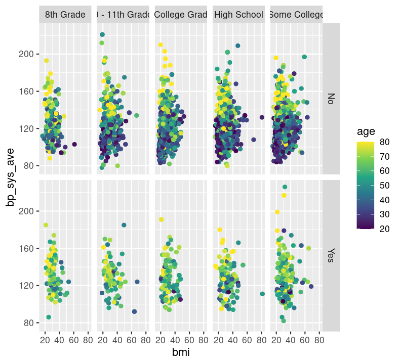
base_scatterplot + theme_bw()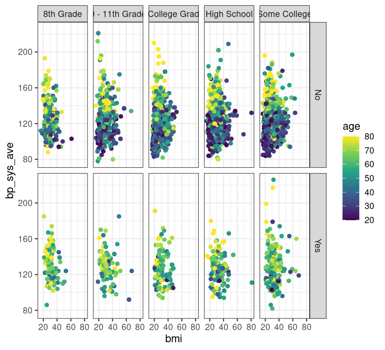
base_scatterplot + theme_minimal()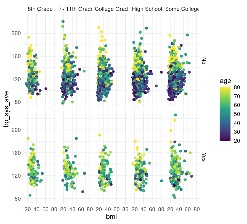
base_scatterplot + theme_classic()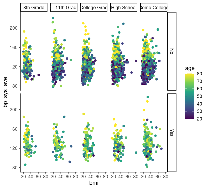
You can also set the theme for all subsequent plots by using the theme_set() function, and specifying the theme you want in the parenthesis.
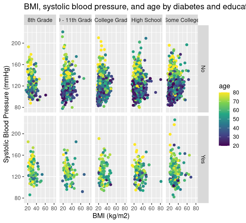
To add labels such as axis titles to your plot, you can use the function labs(). To change the y-axis title, use the y argument in labs(). For the x-axis, it is x. For the whole plot, it is title. Add a new code chunk with Ctrl-Alt-ICtrl-Alt-I or with the Palette (Ctrl-Shift-PCtrl-Shift-P, then type “new chunk”) and type:
doc/learning.qmd
base_scatterplot +
  labs(
    title = "BMI, systolic blood pressure, and age by diabetes and education",
    y = "Systolic Blood Pressure (mmHg)",
    x = "BMI (kg/m2)"
  )
To save the plot you created, use the ggsave() function. The first argument says where to save the graph. Give the name of the newly created file, as well as the folder location. The next argument says which plot to save. At this point, you can set the dimensions of the figure using the width and height arguments. Add a new section header ## Saving the plot and create a new code chunk:
Lastly, let’s run styler with the Palette (Ctrl-Shift-PCtrl-Shift-P, then type “style file”), render the Quarto document with Ctrl-Shift-KCtrl-Shift-K or with the Palette (Ctrl-Shift-PCtrl-Shift-P, then type “render”), commit the changes with Ctrl-Alt-MCtrl-Alt-M or with the Palette (Ctrl-Shift-PCtrl-Shift-P, then type “commit”), and push to GitHub.
aes() (which data to plot), geom_ (what kind of plot), scale_ (to make the plot pretty), and theme() (to control the specifics of the plot).facet_grid().ggsave().